Data and statistics - purpose and aims
Students encounter data and statistics in various occasions in their daily lives, be it in the news, in advertisements or later at work or at the university. It is therefore a widely accepted fact, that it is important for students to acquire the competencies on the one hand to interpret statistics and make reasonable judgements based on them, on the other hand use statistics to back up their arguments. Numerous representations of data can be used to that. Multiple representations provide a good possibility to make the connection between representations clear to students and shed light to their different focuses and intentions, which is why it is advisable to use them when dealing with data and statistics in class.
The main benefit of using ICT in data and statistics is that it is much easier to create sophisticated representations of data that was either manually typed in or even automatically captured by the software from a mathematical or physical model. ICT also enables teachers and students to easily vary parameters and dynamically view the changes the variation induces in the results.  TT link
Absolute and relative frequency
For an event i, the absolute frequency ni is the number of times the event occured in a statistical experiment.
The relative frequency is defined as the absolute frequency divided by the total number of events N in the experiment:
For an event i, the absolute frequency ni is the number of times the event occured in a statistical experiment.
The relative frequency is defined as the absolute frequency divided by the total number of events N in the experiment:
f_i = \frac{n_i}{N}
Example:
A traffic counting
Our table lists all bicycles which have been counted in a given period. The green numbers are the realtive frequency of the counted bicycles per day.
A traffic counting
Our table lists all bicycles which have been counted in a given period. The green numbers are the realtive frequency of the counted bicycles per day.
| Time | Mo | Tu | We |
| 00 - 8am | 16 \frac{16}{37} \approx 43\% |
22 \frac{22}{44} = 50\% |
31 \frac{31}{69} \approx 45\% |
| 8am - 4pm | 20 \frac{20}{37} \approx 54\% |
20 \frac{20}{44} \approx 45\% |
34 \frac{31}{69} \approx 49\% |
| 4pm - 00 | 1 \frac{1}{37} \approx 3\% |
2 \frac{2}{44} \approx 5\% |
4 \frac{4}{69} \approx 6\% |
| sum | 37 | 44 | 69 |
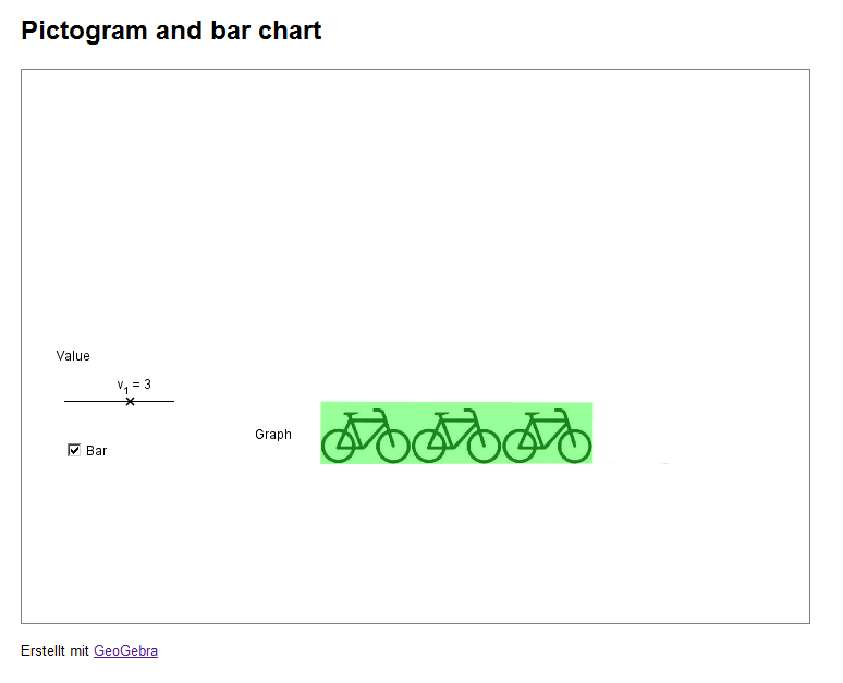
Pictogram and bar chart
One possibility of a graph is a pictogram. A pictogram uses symbols/icons to represent data.
One possibility of a graph is a pictogram. A pictogram uses symbols/icons to represent data.
Example:
In this very short example you see a pictogram of the counted bikes at some location in a certain time interval.
The applet on the right shows how to create a bar chart out of a pictogram.
In this very short example you see a pictogram of the counted bikes at some location in a certain time interval.
| Table | Graphs | ||||||||||
|

|
Basic key figures
For a given sequence of events \left\{ x_1, x_2, ..., x_n \right\} some of the most basic, yet important, key figures in descriptive statistics are:
For a given sequence of events \left\{ x_1, x_2, ..., x_n \right\} some of the most basic, yet important, key figures in descriptive statistics are:
- Arithmetic means
Defined as the quotient of the sum of all values divided by the number of values: \overline{x} = \frac{1}{n} \sum_{i=1}^n x_i - Range
Defined as the difference between minimum and maximum in the sample set. - Median value
Defined as the numerical value, which divides the sample set in two equally large subsets so that each values of one subset is lesser than the median value and each value of the other subset is equal or greater than the median value.
Example:
This table, we find the ages of some players of the Spanish soccer team which won the world championship in 2010 with some of the aforementioned figures:
This table, we find the ages of some players of the Spanish soccer team which won the world championship in 2010 with some of the aforementioned figures:
| Table | Key figures | |||||||||||||||||||||||
|
|
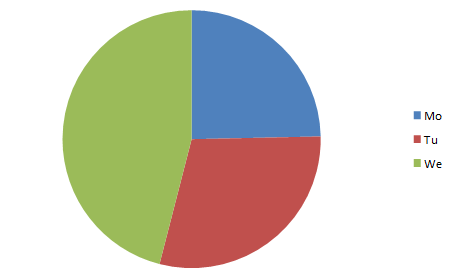
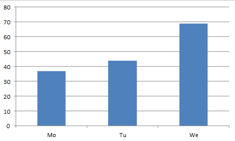
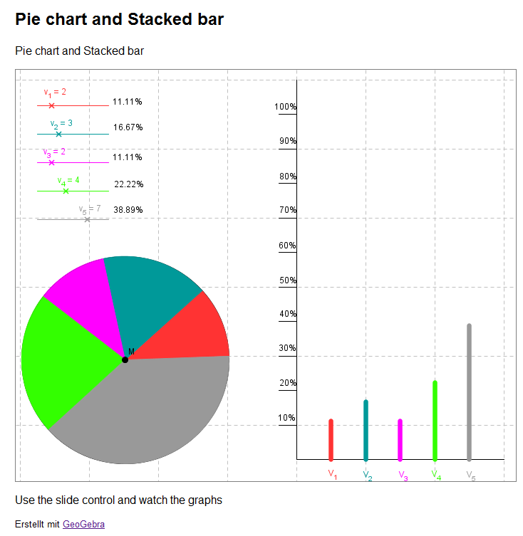
Pie chart and vertical bar chart
In a bar chart, you can represent the absolute or the relative frequency of a sample of data. The bars can be plotted vertically or horizontally. A pie chart always depicts the relative frequency of a sample set.
In a bar chart, you can represent the absolute or the relative frequency of a sample of data. The bars can be plotted vertically or horizontally. A pie chart always depicts the relative frequency of a sample set.
Example:
A traffic count has been conducted in a certain location. We would like to graphically represent the results:
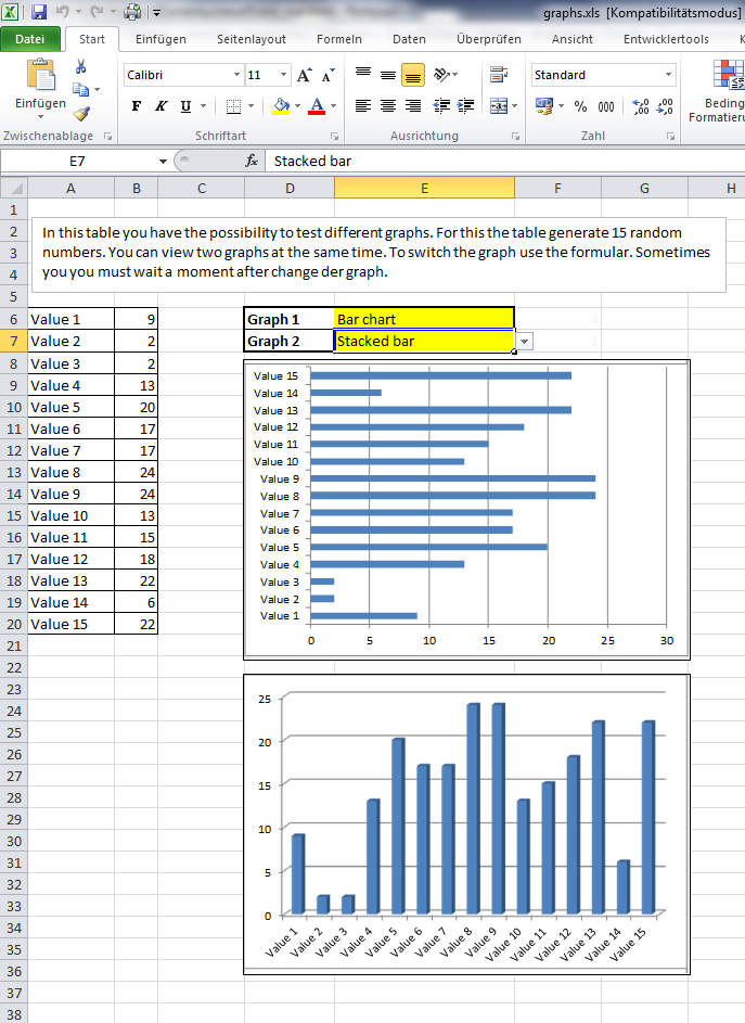
With the Excel file on the right, you can compare some different graphs.
Note: The file only works with Microsoft Office Excel 2007 and 2010, because Open Office and older version of Excel don't support needed functions.
A traffic count has been conducted in a certain location. We would like to graphically represent the results:
| Table | Graphs | ||||||||||
|
|
With the Excel file on the right, you can compare some different graphs.
Note: The file only works with Microsoft Office Excel 2007 and 2010, because Open Office and older version of Excel don't support needed functions.
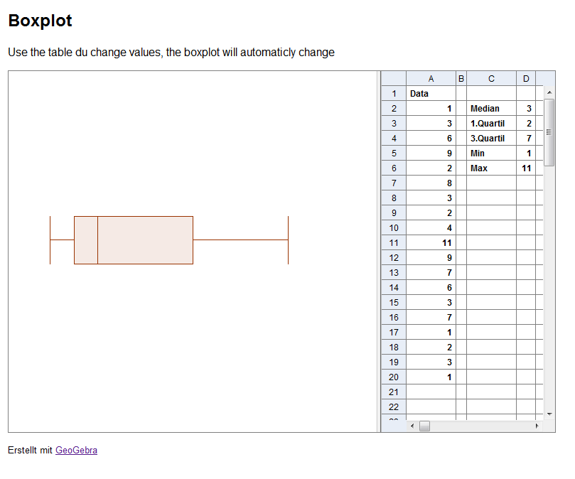
Boxplot
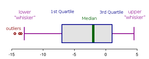 Another important graph is called "boxplot". It represents a number of important figures in one clear represenation. You already know the minimum, maximum and median values.
For a sample set, split by the median into two halves,
Another important graph is called "boxplot". It represents a number of important figures in one clear represenation. You already know the minimum, maximum and median values.For a sample set, split by the median into two halves,
- the 1st quartile is the median of the lower half of the data,
- the 3rd quartile is the median of the upper half of the data.
The original image of the boxplot was provided by user RobSeb via Wikimedia Commons under license CC-BY-SA.
Example:
| Graph | |
| In the image on the right, you can see a list of ordered data. The important key figures are highlighted with colour. The corresponding boxplot is drawn next to it. You can click on the image to enlarge it. |
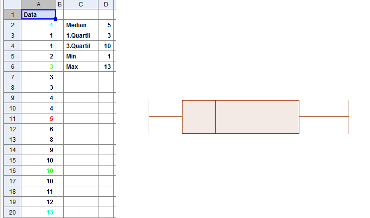
|
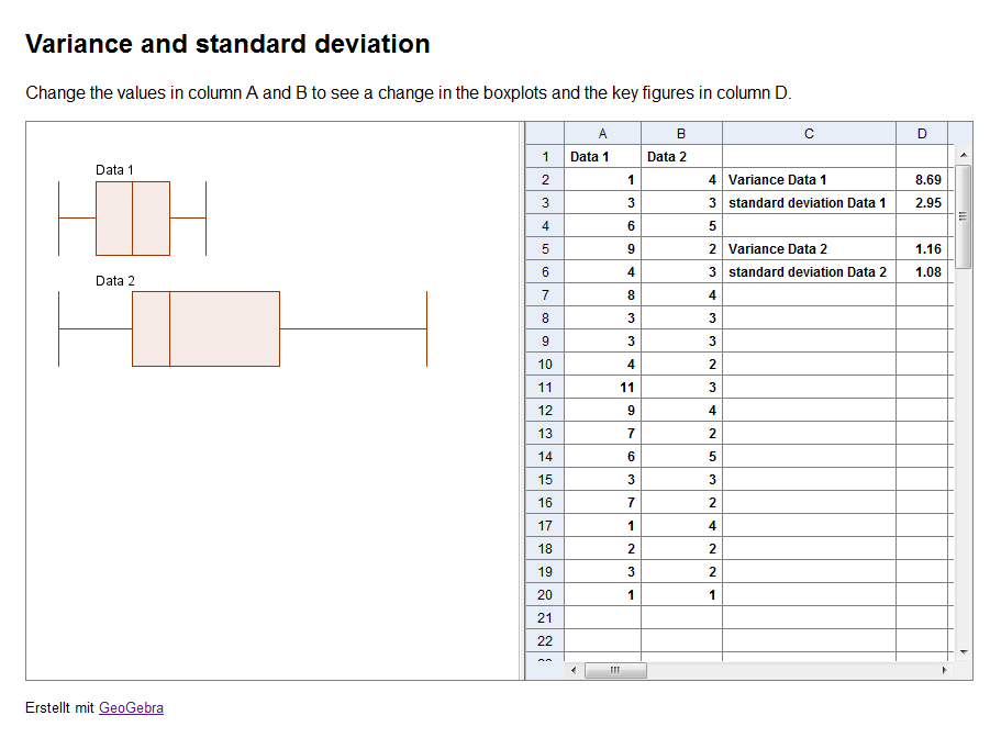
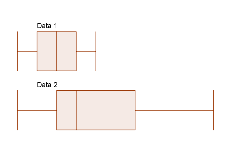
Variance and standard deviation
Last but not least there are two more key figures: the variance and the standard deviation, which measure the statistical dispersion of the sample set.
Last but not least there are two more key figures: the variance and the standard deviation, which measure the statistical dispersion of the sample set.
- Variance
The variance s2 is, in a population of samples, the mean of the squares of the differences between the respective samples and their mean:s^2 = \frac{1}{n} \sum_{i=1}^n (x_i - \overline x)^2 - Standard Deviation
The standard deviation is the square root of the variance:
s = \sqrt{s^2} = \sqrt{\frac{1}{n} \sum_{i=1}^n (x_i - \overline x)^2}
Example:
| Graph | |
| In the image on the right, you can see two boxplots of data set 1 and data set 2. Data set 1 has a variance which is smaller than that of data set 2, visible by the more narrow boxplot. |
|